Docs / 2. Dashboards
2.4 Widgets
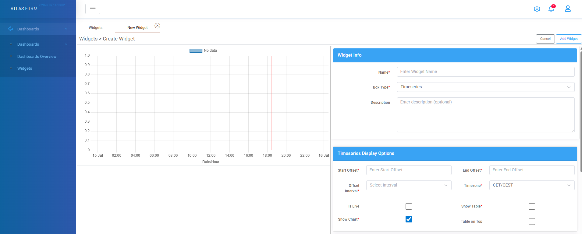
Create a new Widget

Widgets are the core components of the Dashboards, providing users with a flexible and interactive way to visualize and manage data and key indexes. Each widget serves as a customizable element that displays specific information.
Widgets enable users to tailor their dashboards to meet specific business needs by presenting data in a structured and easily accessible format. Users can add existing widgets, create new ones, and configure them based on their requirements. This article will guide users through the functionalities of widgets, including their creation, modification, and integration within dashboards.
The user can create a new widget by clicking the "+" icon. This action redirects the user to a new screen, where the widget can be customized according to specific requirements.
In the first section “Widget Info” the mandatory fields to be completed are:
Widget Name – A required field to define the widget's title.
Box Type – The user must select a widget type (e.g., Timeseries).
Description- an optional memo can be provided to further define the widget's purpose.
In the “Timeseries Display Options” section, the user should define the time scope period for tracking data. This configuration determines how far back and forward in time the timeseries data should be displayed.
The user must enter values in the following fields:
Start Offset – Specifies how far back in time the data should be displayed (e.g., a negative value represents past data).
End Offset – Defines how far forward in time the data should be shown (e.g., a positive value represents future data). A value of zero (0) refers to the current day/time.
Offset Interval – Determines the unit of measurement for the offset values (e.g., Minutes, Hours, Days, Months, Years etc.).
Timezone – Sets the timezone for the timeseries data, with available options including UTC, CET/CEST, EET/EEST, and GAS.
Is Live – Enables real-time updates, continuously retrieving data from the timeseries and dynamically refreshing the chart.
Show Table – Displays the timeseries data in a tabular format.
Show Chart – Generates a visual representation of the timeseries data in chart form. Either show chart or show table option should be enabled.
Table on Top – When enabled, positions the data table above the chart for better visibility and organization.
Example, if the user sets:
Offset Interval: Hours
Timezone: UTC
Start Offset: -3
End Offset: 1
The timeseries will display data in UTC time format, showing values from the past 3 hours and the next 1 hour (if available in the timeseries data source).
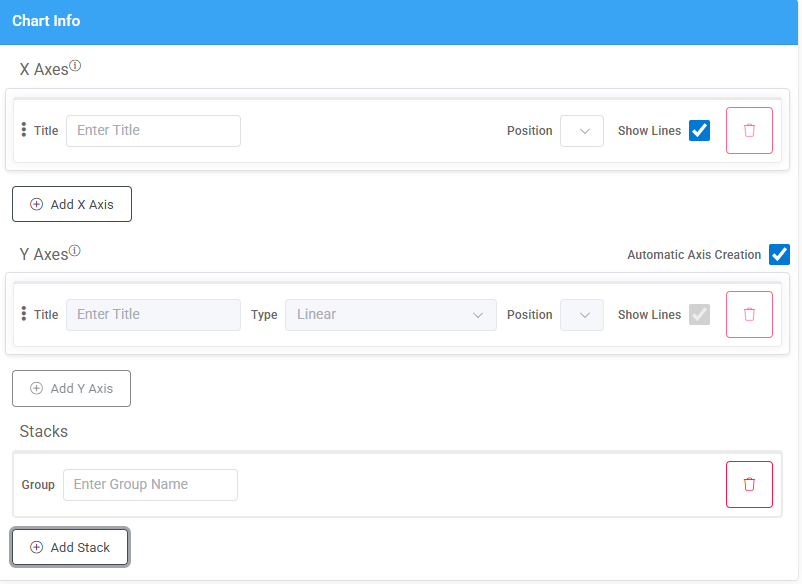
In the “Chart Info” section, the user can configure the axes properties of the chart by customizing them and their display settings.
The following options are available:
Axis Titles – The user can assign a title to the X-axis and Y-axis to define the displayed data.
Axis Position – The position of the axes within the chart can be specified as Top or Bottom for the X-axis and correspondingly for the Y-axis.
Show Lines – The user can choose whether to display the axis lines, which form a grid-like structure in the chart. On Y-Axis there is an option for automatic axis creation, but user can uncheck the box according to needs.
Adding New Axes – Additional axes can be added by clicking "+ Add X Axis" or "+ Add Y Axis".
Deleting an Axis – An existing axis can be removed by clicking the “trash can” button.
These customization options allow users to refine the chart’s appearance and improve data visualization within the widget.
The "Add Stack" button allows the user to overlay one timeseries on top of another, enabling better comparison and visualization of multiple datasets within a single chart.
By clicking the "Add Stack" button, a Group field appears, where the user can assign a custom name to the stacked timeseries group. This helps organize and differentiate stacked data layers effectively. This functionality is particularly useful when visualizing trends, comparing different metrics, or displaying cumulative data within the same chart.
If the user wants to remove a stacked timeseries group, they can do so by clicking the “Trash Can” icon next to the group. This action permanently deletes the selected stack from the chart, allowing for further customization and refinement of the displayed data.
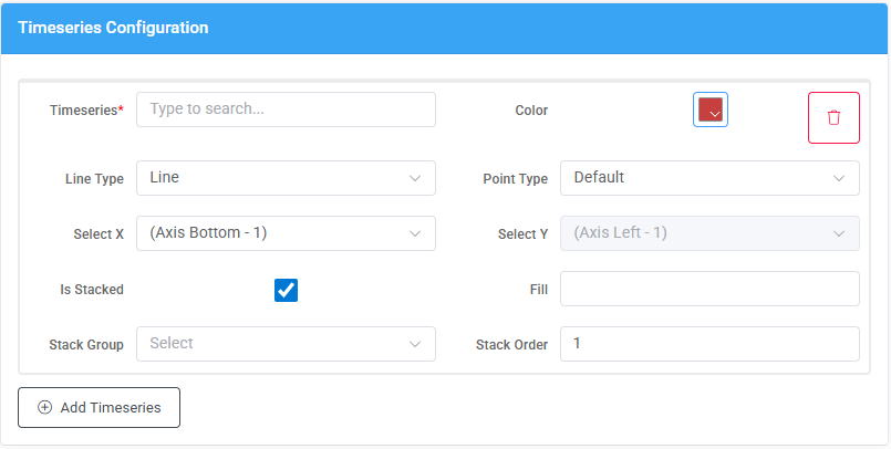
In the “Timeseries Configuration” section, the user must select the timeseries to be displayed. This is done by typing the firsts letters of the desired timeseries in the relevant box, which triggers a dropdown list containing all available timeseries retrieved from the Data room (described in below article).Additionally, the user can refine the search by using the asterisk (*) as a wildcard character. This allows for the combination of words to locate a specific timeseries more efficiently.
In addition to selecting timeseries, users can customize its appearance using various visualization settings. These options enhance readability and improve data representation within the widget.
Available Customization Options:
Color Selection: Allows the user to assign a specific color to the timeseries for clear differentiation.
Line Type: Defines the style of the timeseries representation. Available options include line, dash line, bar, scatter, line step and dash line step.
Point Type: Defines the shape of data points on the chart (e.g., Circle, Cross, etc.).
Axis Selection: The user can assign the timeseries to specific X and Y axes, which is particularly useful when working with multiple axes.
By enabling the "Is Stacked" option, multiple timeseries can be stacked together. When this option is selected, two additional fields appear the “Stack Group” where user can assign the timeseries to a specific stack group and the “Stack Order” which defines the order in which the timeseries is stacked relative to others.
The Fill option determines how the area beneath the timeseries is shaded. It can take the following values:
true – Fills the area between the timeseries and the zero line.
-1 – Fills the area between the current timeseries and the previous one.
+1 – Fills the area between the current timeseries and the next one.
Add Timeseries: Opens a new field with all the above options to add multiple dataseries in a widget.
Once all parameters have been configured, the user must click the "Add Widget" button located at the top-right corner of the screen to finalize and create the new widget.
Was this helpful?